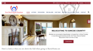
Welcome to the second edition of Behind the Curtain! This next instalment is taking a look at BarrieHome.net, the website of The Trevor Shaw & Heather Beauschesne Team. Let’s not waste any time, let’s get right to it. Here is the Home Page:
The home page certainly has some things to like about it. At the top it very clearly states their contact information. This makes it very easy for people to get a hold of them if they want to. Your website should always make it easy to be contacted. While many won’t contact you on the phone straight off your website, you do want to make it easy for those who do.
They also link to their social media. What I like here is that they just have Facebook and YouTube which is nice to see them only linking to sites they use and not all of them just for the sake of having them. The only comment I have here is that the YouTube link goes to the YouTube channel of their photographer. The problem is their photographer isn’t exclusive to them so their competitors listings show up when the link is clicked on.
Judging by the look of the home page and the information presented their primary focus is on relocations. Its the main call to action above the fold and immediately below the fold is another call to action for military relocations. After having spoken with Heather Beauschesne I know that relocations aren’t their primary source of business. They do them and do them well but its not where the majority of their business comes from at the time. So I’d recommend not putting such a heavy focus on relocations and more towards whats working most of them.
Floating on the ride side of the screen is a red calculator logo. These types of add-ons can be useful but this one is lacking in execution. It’s the right idea to help visitors but there should be a button to collect a lead off the form. As well, it may be more effective for lead generation purposes to include a live chat feature instead of a mortgage calculator. I’d make the mortgage calculator a standalone page under the Buyers Tab.
Under the current listings section I’d remove most of the paragraph, if not all of it, describing why people should move to Barrie. If they want to come look at Current listings they have probably already looked at reasons to move to Barrie. This type of page, a “Why Barrie” or “Why ANY SERVICE AREA” would be better as a standalone page
The section at the bottom out ready for the next step and help for first time buyers are great to include at the bottom of the page. The further people get through your site and more time spent on it the more likely they are to convert so having that is a good attempt to boost conversions. It would be interesting to see the numbers on how many times these are actually clicked on though.
As a general note for most of the website, the written copy is often too long. It gives off the impression that the page is just trying to be filled with as much as possible and not necessarily including just what is important. I’d put some effort into saying less and making it more interesting for the website visitors.
A few other notes about the website:
- Love the section with the multiple downloadable guides. It would be worth making the switch though to have them leave their contact information in exchange for accessing these guides though so they act as a form of lead generation.
- First Time Buyers page is good because it links to actual resources that can help them and provides value of those coming to the page. Still a little heavy on copy though. Make it simpler and you will see more conversions most likely.
- Don’t need both the home worth and home evaluation pages. This splits the traffic. It would be better to include them on one page and then in the contact form for the home worth page include a checkbox for “If you’d like a more accurate report on the value of your home check this box for an customized in-person evaluation”.
- Regular posting to the blog is good but I’d add some images to it.
- On the contact page I’d flip the contact information to the top and move the map down. Most people coming to this page want to see the contact information, not the map.
This website has a lot of potential but I think would need some improvements to start generating consistent leads. It has a lot of things to like and needs more of a tune up than a full rebuild necessarily.
If you’d like to have your website featured on a future Behind the Curtain post then let me know.


0 Comments